Introduction to Bold Typography
Typography is a fundamental aspect of design that can significantly influence how a message is perceived. Among the various typographic styles, bold typography stands out as a powerful tool for grabbing attention and conveying importance. In this blog post, we will explore my use of bold typography across various projects, showcasing how it can transform a design and enhance user engagement.
The Importance of Typography in Design
Typography is not just about choosing fonts; it’s about creating a visual hierarchy that guides the reader’s eye. Here are some key reasons why typography is vital in design:
- Enhances Readability: Well-chosen typography can make text easier to read, ensuring that your message is communicated effectively.
- Creates Visual Hierarchy: Different font weights and sizes help establish a hierarchy, allowing the viewer to navigate content intuitively.
- Sets the Tone: Typography can evoke emotions and set the overall mood of a design, influencing how a brand is perceived.
- Improves User Experience: A well-structured typographic layout can enhance the overall user experience, making information easier to digest.
Exploring Bold Typography in My Projects
1. Website Design
In web design, bold typography can be used to create focal points that draw the user’s attention. Here’s how I’ve implemented it:
- Headings: Using bold typefaces for headings helps to differentiate sections and guide users through the content.
- Call to Action Buttons: Bold text on buttons can make them stand out, encouraging users to take action.
- Quotes and Testimonials: Highlighting important quotes in bold can add emphasis and credibility to the content.
For instance, in a recent project for a tech startup, I used bold typography for the main headings and call-to-action buttons, which resulted in a noticeable increase in user engagement and click-through rates.
2. Print Media
Bold typography is equally effective in print media. Here are some applications I’ve found successful:
- Posters: Bold fonts can create striking visual statements, perfect for grabbing attention in busy environments.
- Brochures: Using bold typography for key points ensures that essential information is not overlooked.
- Business Cards: A bold name or logo can leave a lasting impression on potential clients.
In a recent brochure design for a local event, I utilized bold typography to highlight the event’s key details, making it visually appealing and easy to read at a glance.
3. Branding and Identity
Bold typography plays a crucial role in establishing a brand’s identity. Here’s how I’ve utilized it in branding projects:
- Logos: A bold typeface can make a logo memorable and recognizable.
- Brand Guidelines: Consistent use of bold typography in brand materials reinforces brand identity.
- Packaging: Bold labels can attract attention on store shelves, influencing purchasing decisions.
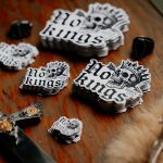
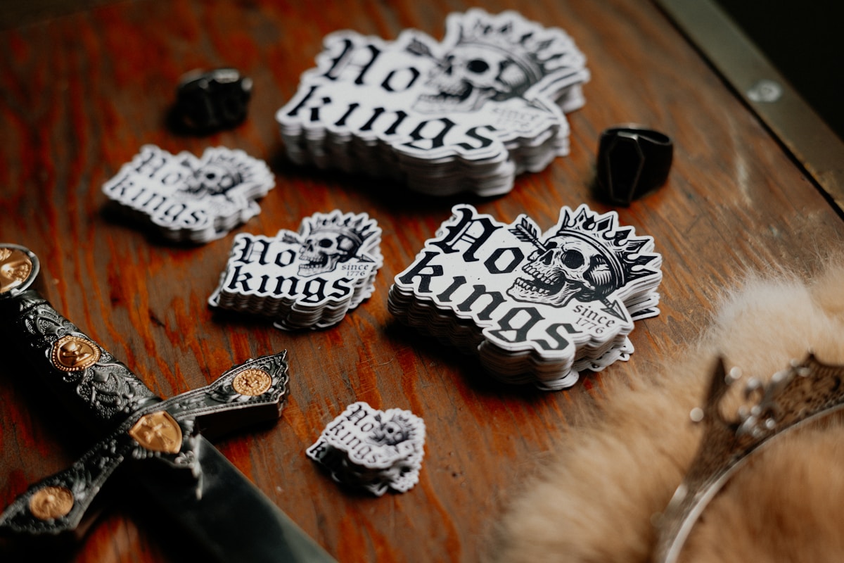
For example, in rebranding a food product, I chose a bold typeface for the logo and packaging, which helped the product stand out in a competitive market.
Best Practices for Using Bold Typography
While bold typography can be impactful, it’s essential to use it judiciously. Here are some best practices to keep in mind:
- Balance: Ensure that bold typography is balanced with lighter text to maintain visual harmony.
- Limit Usage: Use bold text sparingly to avoid overwhelming the reader.
- Contrast: Ensure there is enough contrast between the bold text and the background for readability.
- Consistency: Maintain consistent use of bold typography across all materials to reinforce brand identity.
Conclusion
Bold typography is a powerful design element that can transform a project, whether in digital or print media. By strategically using bold fonts, designers can enhance readability, create visual hierarchy, and establish a strong brand identity. As I continue to explore bold typography in my projects, I look forward to discovering new ways to harness its potential for impactful design.